What is Data Visualization? A Complete Guide to Tools, Techniques, and Best Practices
What is Data Visualization? A Complete Guide to Tools, Techniques, and Best Practices
Imagine scrolling through endless rows of data, unable to spot the insights hidden within. That’s the reality for many businesses today, with an estimated 402.74 million terabytes of data generated daily. So how do we make sense of it all? The answer lies in data visualization.
Organizations and individuals leverage data to determine the causes of problems and identify actionable steps. However, with an ever-growing amount of data, it becomes increasingly challenging to make sense of it all. Our innate nature is to search for patterns and find structure. This is how we store information and learn new insights. When incoming data is not presented in a visually pleasing way, seeing these patterns and finding structure can be difficult or, in some cases, impossible.
In this article, we will examine how data visualization can solve the above problem. We will also discuss what data visualization is, why it is important, tips for developing your skills, common graphs, and tools for visualizing your data.
What is Data Visualization?
Data visualization is the process of graphically representing data. It is the act of translating data into a visual context, which can be done using charts, plots, animations, infographics, etc. The idea behind it is to make it easier for us to identify trends, outliers, and patterns in data. We explore this concept more in our Understanding Data Visualization course.
Data professionals regularly leverage data visualizations to summarize key insights from data and relay that information back to the appropriate stakeholders.
For example, a data professional may create data visualizations for management personnel, who then leverage those visualizations to project the organizational structure. Another example is when data scientists use visualizations to uncover the underlying structure of the data to provide them with a better understanding of their data.
Given the defined purpose of data visualization stated above, there are two vital insights we can take away from what data visualization is:
1) A way to make data accessible: The best way to make something accessible is to keep things simple. The word ‘simple’ here needs to be put into context: what is straightforward for a ten-year-old to understand may not be the same for a Ph.D holder. Thus, data visualization is a technique used to make data accessible to whomever it may concern.
2) A way to communicate: This takeaway is an extension of the first. To communicate effectively, everyone in the room must be speaking the same language. It does not matter if you are working on a task independently or with a team, visualizations should derive interesting insights relative to those who may view them. A CEO may prefer to view insights that provide actionable steps, and a machine learning team may prefer to view insights into how their models perform.
In short, data visualization is a technique used to make it easier to recognize patterns or trends in data.
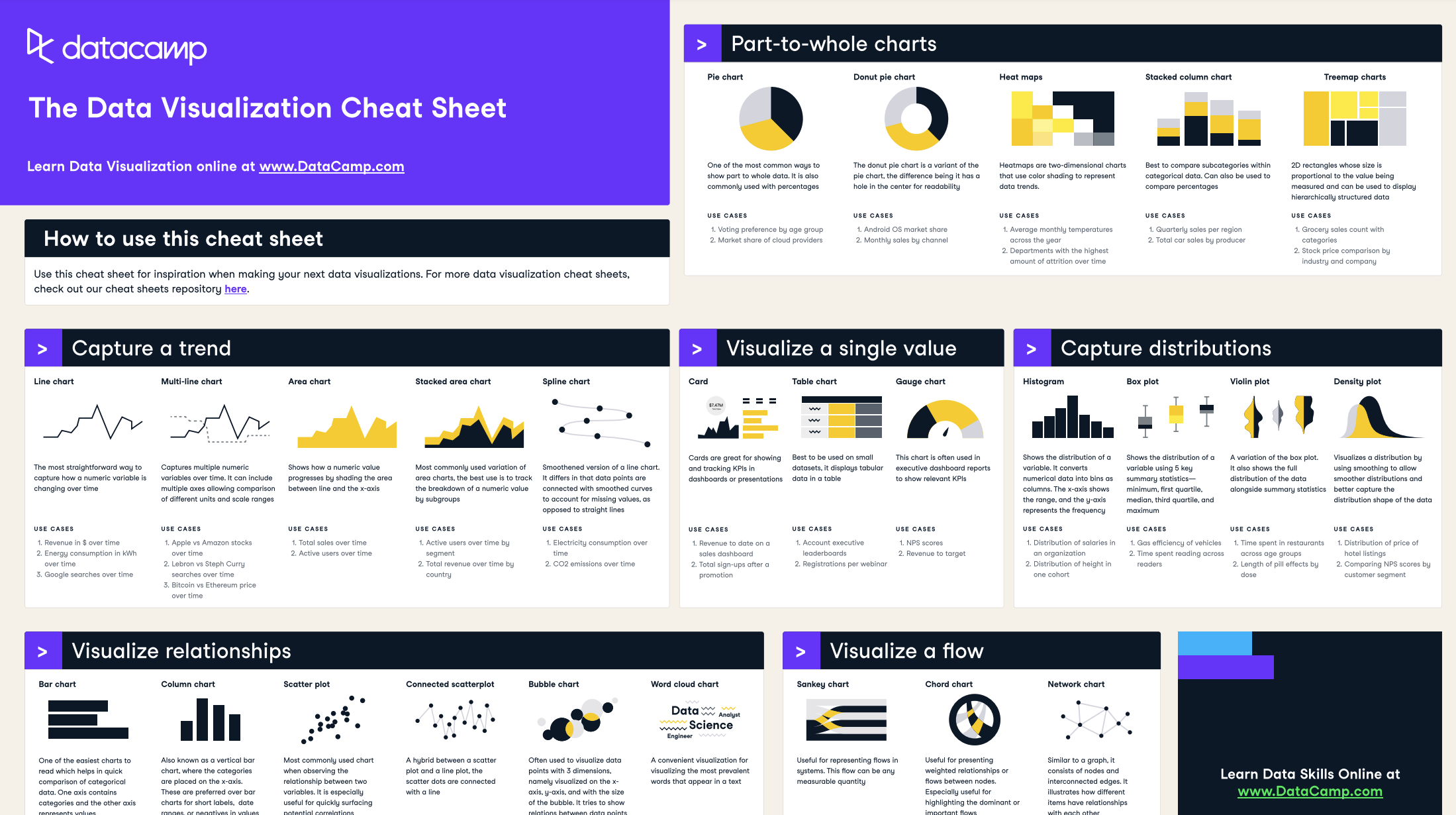
Our data visualization cheat sheet gives a visual representation of the concepts of data visualization