Presenting qualitative data
Presenting qualitative data
In the end, presenting qualitative research findings is just as important a skill as mastery of qualitative research methods for the data collection and data analysis process. Simply uncovering insights is insufficient to the research process; presenting a qualitative analysis holds the challenge of persuading your audience of the value of your research. As a result, it’s worth spending some time considering how best to report your research to facilitate its contribution to scientific knowledge.

How do you present qualitative data?
When it comes to research, presenting data in a meaningful and accessible way is as important as gathering it. This is particularly true for qualitative research, where the richness and complexity of the data demand careful and thoughtful presentation. Poorly written research is taken less seriously and left undiscussed by the greater scholarly community; quality research reporting that persuades its audience stands a greater chance of being incorporated in discussions of scientific knowledge.
Qualitative data presentation differs fundamentally from that found in quantitative research. While quantitative data tend to be numerical and easily lend themselves to statistical analysis and graphical representation, qualitative data are often textual and unstructured, requiring an interpretive approach to bring out their inherent meanings. Regardless of the methodological approach, the ultimate goal of data presentation is to communicate research findings effectively to an audience so they can incorporate the generated knowledge into their research inquiry.
As the section on research rigor will suggest, an effective presentation of your research depends on a thorough scientific process that organizes raw data into a structure that allows for a thorough analysis for scientific understanding.
Preparing the data
The first step in presenting qualitative data is preparing the data. This preparation process often begins with cleaning and organizing the data. Cleaning involves checking the data for accuracy and completeness, removing any irrelevant information, and making corrections as needed. Organizing the data often entails arranging the data into categories or groups that make sense for your research framework.

Coding the data
Once the data are cleaned and organized, the next step is coding, a crucial part of qualitative data analysis. Coding involves assigning labels to segments of the data to summarize or categorize them. This process helps to identify patterns and themes in the data, laying the groundwork for subsequent data interpretation and presentation. Qualitative research often involves multiple iterations of coding, creating new and meaningful codes while discarding unnecessary ones, to generate a rich structure through which data analysis can occur.
Uncovering insights
As you navigate through these initial steps, keep in mind the broader aim of qualitative research, which is to provide rich, detailed, and nuanced understandings of people’s experiences, behaviors, and social realities. These guiding principles will help to ensure that your data presentation is not only accurate and comprehensive but also meaningful and impactful.
While this process might seem intimidating at first, it’s an essential part of any qualitative research project. It’s also a skill that can be learned and refined over time, so don’t be discouraged if you find it challenging at first. Remember, the goal of presenting qualitative data is to make your research findings accessible and understandable to others. This requires careful preparation, a clear understanding of your data, and a commitment to presenting your findings in a way that respects and honors the complexity of the phenomena you’re studying.
In the following sections, we’ll delve deeper into how to create a comprehensive narrative from your data, the visualization of qualitative data, and the writing and publication processes. Let’s briefly excerpt some of the content in the articles in this part of the guide.
Data visualization
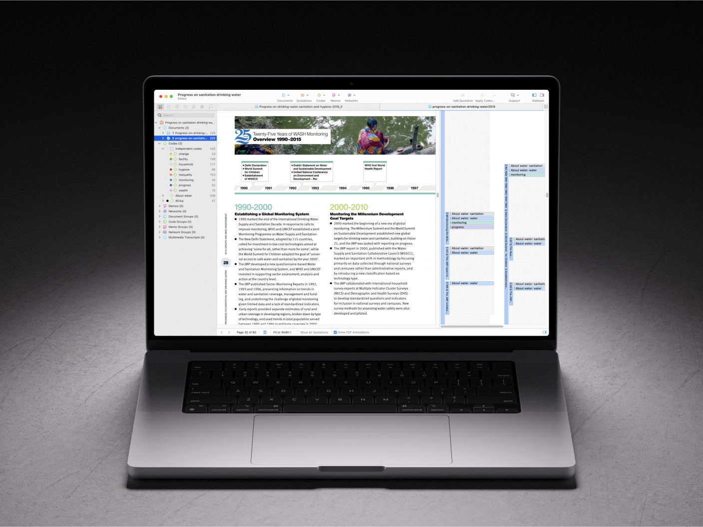
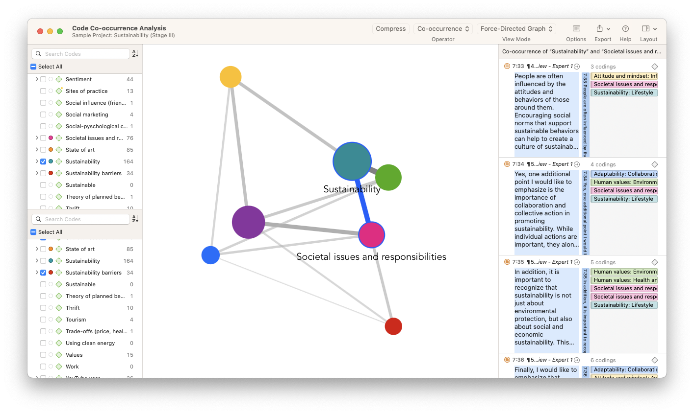
How often do you read a research article and skip straight to the tables and figures? That’s because data visualizations representing qualitative and quantitative data have the power to make large and complex research projects with thousands of data points comprehensible when authors present data to research audiences. Researchers create visual representations to help summarize the data generated from their study and make clear the pathways for actionable insights.
In everyday situations, a picture is always worth a thousand words. Illustrations, figures, and charts convey messages that words alone cannot. In research, data visualization can help explain scientific knowledge, evidence for data insights, and key performance indicators in an orderly manner based on data that is otherwise unstructured.
For all of the various data formats available to researchers, a significant portion of qualitative and social science research is still text-based. Essays, reports, and research articles still rely on writing practices aimed at repackaging research in prose form. This can create the impression that simply writing more will persuade research audiences. Instead, framing research in terms that are easy for your target readers to understand makes it easier for your research to become published in peer-reviewed scholarly journals or find engagement at scholarly conferences. Even in market or professional settings, data visualization is an essential concept when you need to convince others about the insights of your research and the recommendations you make based on the data.
Importance of data visualization
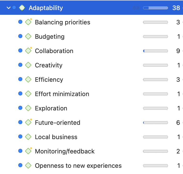
Data visualization is important because it makes it easy for your research audience to understand your data sets and your findings. Also, data visualization helps you organize your data more efficiently. As the explanation of ATLAS.ti’s tools will illustrate in this section, data visualization might point you to research inquiries that you might not even be aware of, helping you get the most out of your data. Strictly speaking, the primary role of data visualization is to make the analysis of your data, if not the data itself, clear. Especially in social science research, data visualization makes it easy to see how data scientists collect and analyze data.