Common Graphs Used for Data Visualization
Common Graphs Used for Data Visualization
We have established that data visualization is an effective way to present and communicate with data. In this section, we will cover how we can create some common types of charts & graphs, which are an effective starting point for most data visualization tasks, by using Python and the Matplotlib python package for data visualization. We will also share some use cases for each graph.
You can check out this DataLab workbook to access the full code.
Frequency table
A frequency table is a great way to represent the number of times an event or value occurs. We typically use them to find descriptive statistics for our data. For example, we may wish to understand the effect of one feature on the final decision.
Let’s create an example frequency table. We will use the Car Evaluation Data Set from the UCI Machine Learning repository and Pandas to build our frequency table.
import pandas as pd"""source: https://heartbeat.comet.ml/exploratory-data-analysis-eda-for-categorical-data-870b37a79b65"""def frequency_table(data:pd.DataFrame, col:str, column:str): freq_table = pd.crosstab(index=data[col], columns=data[column], margins=True) rel_table = round(freq_table/freq_table.loc["All"], 2) return freq_table, rel_tablebuying_freq, buying_rel = frequency_table(car_data, "class", "buying")print("Two-way frequency table")print(buying_freq)print("---" * 15)print("Two-way relative frequency table")print(buying_rel)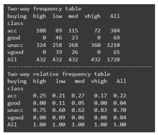
Bar graph
The bar graph is among the most simple yet effective data visualizations around. It is typically deployed to compare the differences between categories. For example, we can use a bar graph to visualize the number of fraudulent cases to non-fraudulent cases. Another use case for a bar graph may be to visualize the frequencies of each star rating for a movie.
Here is how we would create a bar graph in Python:
"""Starter code from tutorials pointsee: https://bit.ly/3x9Z6HU"""import matplotlib.pyplot as plt# Dataset creation.programming_languages = ['C', 'C++', 'Java', 'Python', 'PHP', "Other", "None"]employees_frequency = [23, 17, 35, 29, 12, 5, 38]# Bar graph creation.fig, ax = plt.subplots(figsize=(10, 5))plt.bar(programming_languages, employees_frequency)plt.title("The number of employees competent in a programming langauge")plt.xlabel("Programming languages")plt.ylabel("Frequency")plt.show()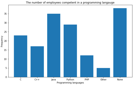
Pie charts
Pie charts are another simple and efficient visualization tool. They are typically used to visualize and compare parts of a whole. For example, a good use case for a pie chart would be to represent the market share for smartphones. Let’s implement this in Python.
"""Example to demonstrate how a pie chart can be used to represent the marketshare for smartphones.Note: These are not real figures. They were created for demonstration purposes."""import numpy as npfrom matplotlib import pyplot as plt# Dataset creation.smartphones = ["Apple", "Samsung", "Huawei", "Google", "Other"]market_share = [50, 30, 5, 12, 2]# Pie chart creationfig, ax = plt.subplots(figsize=(10, 6))plt.pie(market_share, labels = smartphones, autopct='%1.2f%%')plt.title("Smartphone Marketshare for April 2021 - April 2022", fontsize=14)plt.show()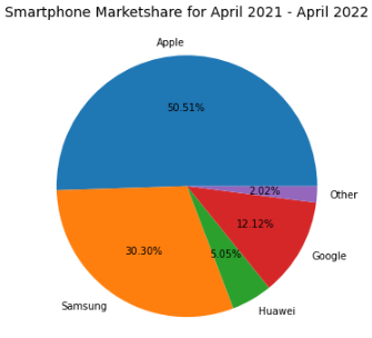
Line graphs and area charts
Line graphs are great for visualizing trends or progress in data over a period of time. For example, we can visualize the number of sneaker sales for the month of July with a line graph.
import matplotlib.pyplot as plt# Data creation.sneakers_sold = [10, 12, 8, 7, 7, 10]dates = ["Jul '1", "Jul '7", "Jul '14", "Jul '21", "Jul '28", "Jul '31"]# Line graph creationfig, ax = plt.subplots(figsize=(10, 6))plt.plot(dates, sneakers_sold)plt.title("Sneakers sold in Jul")plt.ylim(0, 15) # Change the range of y-axis.plt.xlabel("Dates")plt.ylabel("Number of sales")plt.show()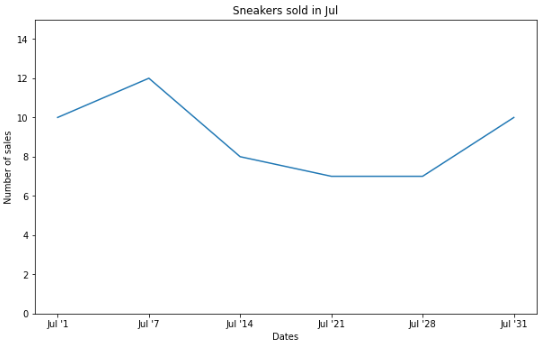
An area chart is an extension of the line graph, but they differ in that the area below the line is filled with a color or pattern.
Here is the exact same data above plotted in an area chart:
# Area chart creationfig, ax = plt.subplots(figsize=(10, 6))plt.fill_between(dates, sneakers_sold)plt.title("Sneakers sold in Jul")plt.ylim(0, 15) # Change the range of y-axis.plt.xlabel("Dates")plt.ylabel("Number of sales")plt.show()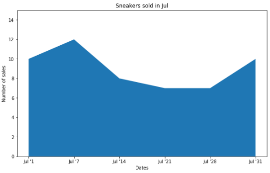
It is also quite common to see stacked area charts that illustrate the changes of multiple variables over time. For instance, we could visualize the brands of the sneakers sold in the month of July rather than the total sales with a stacked area chart.
# Data creation.sneakers_sold = [[3, 4, 2, 4, 3, 1], [3, 2, 6, 1, 3, 5], [4, 6, 0, 2, 1, 4]]dates = ["Jul '1", "Jul '7", "Jul '14", "Jul '21", "Jul '28", "Jul '31"]# Multiple area chart creationfig, ax = plt.subplots(figsize=(10, 6))plt.stackplot(dates, sneakers_sold, labels=["Nike", "Adidas", "Puma"])plt.title("Sneakers sold in Jul")plt.ylim(0, 15) # Change the range of y-axis.plt.xlabel("Dates")plt.ylabel("Number of sales")plt.legend()plt.show()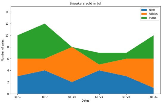
Each plot is showing the exact same data but in a different way.
Histograms
Histograms are used to represent the distribution of a numerical variable.
import numpy as npimport matplotlib.pyplot as pltdata = np.random.sample(size=100) # Graph will change with each runfig, ax = plt.subplots(figsize=(10, 6))plt.hist(data, bins=6)plt.title("The distribution of data")plt.xlabel("Data")plt.ylabel("Frequency")plt.show()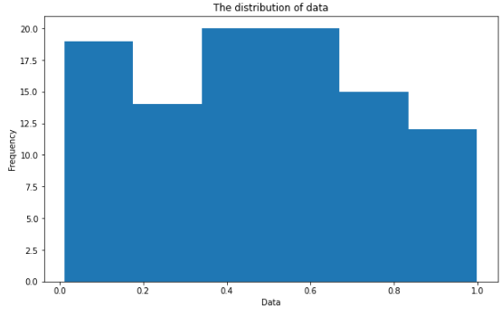
Scatter plots
Scatter plots are used to visualize the relationship between two different variables. It is also quite common to add a line of best fit to reveal the overall direction of the data. An example use case for a scatter plot may be to represent how the temperature impacts the number of ice cream sales.
import numpy as npimport matplotlib.pyplot as plt# Data creation.temperature = np.array([30, 21, 19, 25, 28, 28]) # Degree's celsiusice_cream_sales = np.array([482, 393, 370, 402, 412, 450])# Calculate the line of best fitX_reshape = temperature.reshape(temperature.shape[0], 1)X_reshape = np.append(X_reshape, np.ones((temperature.shape[0], 1)), axis=1)y_reshaped = ice_cream_sales.reshape(ice_cream_sales.shape[0], 1)theta = np.linalg.inv(X_reshape.T.dot(X_reshape)).dot(X_reshape.T).dot(y_reshaped)best_fit = X_reshape.dot(theta)# Create and plot scatter chartfig, ax = plt.subplots(figsize=(10, 6))plt.scatter(temperature, ice_cream_sales)plt.plot(temperature, best_fit, color="red")plt.title("The impact of weather on ice cream sales")plt.xlabel("Temperature (Celsius)")plt.ylabel("Ice cream sales")plt.show()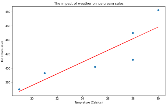
Heatmaps
Heatmaps use a color-coding scheme to depict the intensity between two items. One use case of a heatmap could be to illustrate the weather forecast (i.e. the areas in red show where there will be heavy rain). You can also use a heatmap to represent web traffic and almost any data that is three-dimensional.
To demonstrate how to create a heatmap in Python, we are going to use another library called Seaborn – a high-level data visualization library based on Matplotlib.
import numpy as npimport seaborn as snsimport matplotlib.pyplot as pltdata = np.random.rand(8, 10) # Graph will change with each runfig, ax = plt.subplots(figsize=(10, 6))sns.heatmap(data)plt.title("Random Uniform Data")plt.show()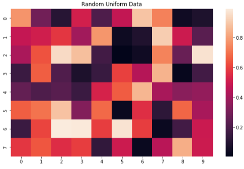
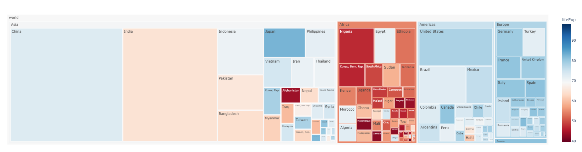
Treemaps
Treemaps are used to represent hierarchical data with nested rectangles. They are great for visualizing part-to-whole relationships among a large number of categories such as in sales data.
To help us build our treemap in Python, we are going to leverage another library called Plotly, which is used to make interactive graphs.
"""Source: https://plotly.com/python/treemaps/"""import plotly.express as pximport numpy as npdf = px.data.gapminder().query("year == 2007")fig = px.treemap(df, path=[px.Constant("world"), 'continent', 'country'], values='pop', color='lifeExp', hover_data=['iso_alpha'], color_continuous_scale='RdBu', color_continuous_midpoint=np.average(df['lifeExp'], weights=df['pop']))fig.update_layout(margin = dict(t=50, l=25, r=25, b=25))fig.show()