Data Analytics Projects for Final Year Students
Data Analytics Projects for Final Year Students
Final year student projects are usually research-based and require at least 2-3 months to complete. You will be working on a specific topic and trying to improve the results using various statistical and probability techniques.
Note: there is a growing trend for machine learning projects for data analytics final-year projects.
13. Reducing Traffic Mortality in the USA
For the Reducing Traffic Mortality in the USA project, you will find a good strategy for reducing traffic-related deaths in the USA. You will be importing, cleaning, manipulating, and visualizing the data. Furthermore, you will perform feature engineering and apply various machine learning models (multivariate linear regression, KMeans clustering) to come up with stately and communicate the results.
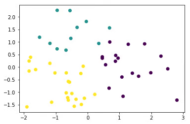
Image from the project
If you want to learn more about unsupervised learning, check out Cluster Analysis in Python course.
14. Assessing the Effectiveness of Medical Treatments
In the Assessing the Effectiveness of Medical Treatments project, you’ll explore the fascinating case of Simpson’s Paradox in a kidney stone treatment study. Using R, you’ll apply regression analysis to uncover hidden insights and better understand how outcomes vary across patient groups.
15. World Population Analysis
The World Population Analysis project is the best example of performing deep exploratory analysis. You will be exploring various columns, visualizing the least and most populated countries, and exploring population density and growth rate. Furthermore, you will display the country rank distribution and correlation map.
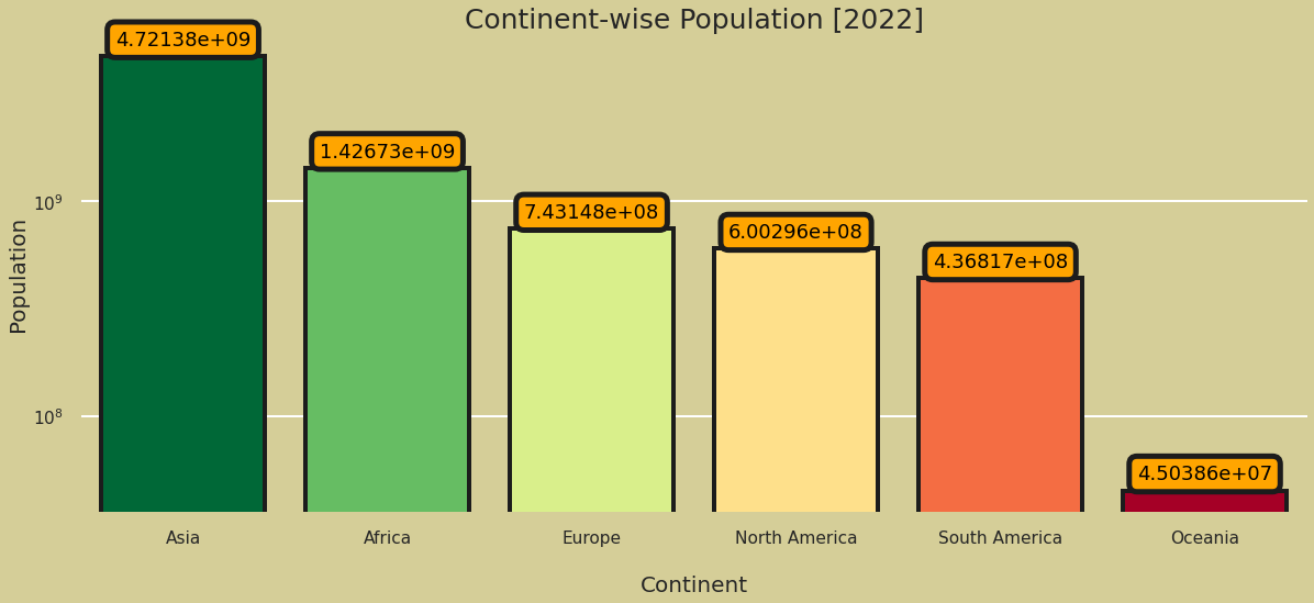
Image from the project
Learn easy ways to plot data visualization in Python by completing Intermediate Data Visualization with Seaborn course.
16. Data Science and MLOps Landscape in Industry
The Data Science and MLOps Landscape in Industry project is a holy grail for all data manipulation, visualizations, and exploratory and geospatial analysis. You will learn to effectively use box plots, doughnut charts, bar charts, heatmaps, parallel categorical graphs, bubble charts, funnel charts, radar charts, icicle charts, and maps. Furthermore, you will learn to interpret various types of graphs.
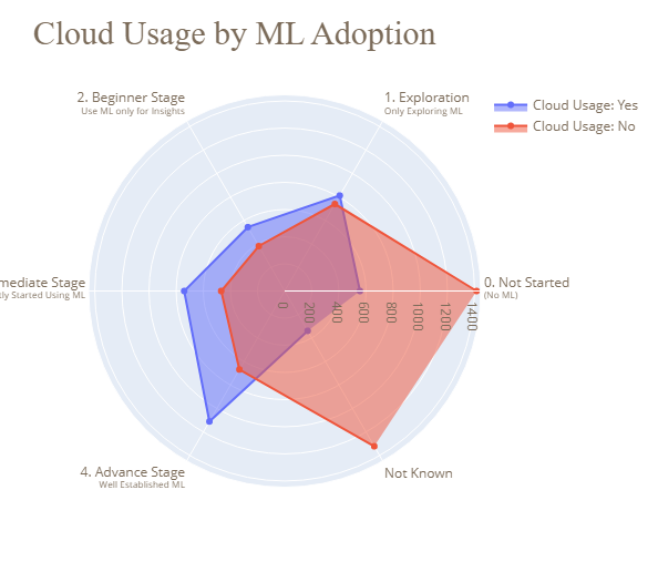
Image from the project
Take Introduction to Data Visualization with Plotly in Python course to learn about advanced Plotly features and customization.