Data Visualization Projects for Beginners
Data Visualization Projects for Beginners
Beginner projects focus on building foundational skills and getting started with understanding visuals.
Focus on learning tools like Excel and basic Matplotlib with easy graphs such as scatter plots, line charts, and bar charts. Starting with easy-to-understand visuals that support what you know about the data is a great way to build foundational skills in data visualization.
At this stage, consider taking a beginner’s course like Understanding Data Visualization and working on some projects.
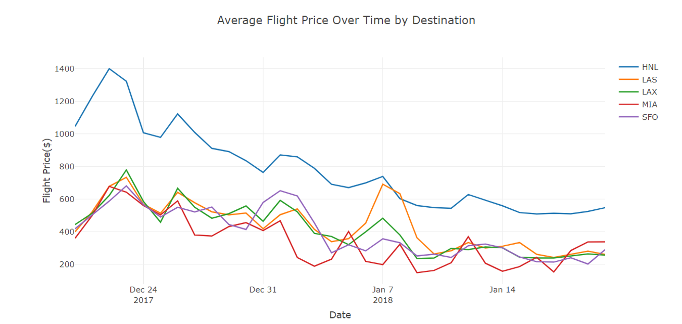
Project 1: Plotting flight costs by day of the week
This project idea involves creating one or more scatter plots using Excel to visualize airline ticket prices across different days of the week. You can work with a dataset containing flight costs for the days of the week, possibly creating multiple charts for different routes or airlines. Plot the prices using Excel’s scatter plot feature, with days of the week on the x-axis and ticket costs on the y-axis.
This project is an excellent starting point for beginners. It introduces key concepts of data visualization using the widely accessible Excel software. It allows newcomers to work with real-world data that’s both relatable and potentially useful in their own lives.
The project provides hands-on experience in transforming raw numerical data into a visual format that can reveal patterns in flight pricing, such as which days tend to be cheaper or more expensive for travel.
The skills and tools learned or reinforced by completing this project are:
- Using Excel to visualize data
- Data entry and organization
- Understanding of different chart types and their appropriate uses
- Data exploration and pattern recognition
Exploring data on airline prices from TripAdvisor. Image source: NYCDataScience
Project 2: Create Phyllotaxis Art with R
If you’d like to be guided, the “Creating Floral Patterns Inspired by Phyllotaxis” project explores the intersection of mathematics, nature, and art through data visualization in R. Using the concept of phyllotaxis—the arrangement of leaves on plant stems—you’ll create visually stunning spirals that mimic natural patterns found in flowers and plants. Phyllotaxis is a prime example of how mathematical principles such as the Fibonacci sequence and the golden angle can describe natural beauty.
By the end of the project, you’ll have crafted your flower art, utilizing data visualization techniques to showcase the elegance of these natural patterns. This project is perfect for those who want to mix creativity with data science, all while deepening their understanding of mathematical models in nature.
Data visualization skills learned in this project are:
- Creating visualizations in R using tools like ggplot2
- Understanding and implementing the mathematics behind natural patterns
- Enhancing your R coding skills by generating and manipulating data to represent beautiful shapes
- Learning how transformations like rotations and scaling can be applied to create intricate designs
Project 3: Visualizing the history of Nobel Prize winners
The “Visualizing the History of Nobel Prize Winners” project explores historical data surrounding one of the world’s most prestigious awards. It involves analyzing and visualizing data on Nobel Prize laureates across different categories, years, and demographics.
This project is an excellent choice for beginners because it combines data manipulation with meaningful visualization tasks using an interesting and manageable dataset.
The project allows you to practice various visualization techniques while engaging with real-world data that has cultural and historical significance. It also introduces the important concept of using data visualization to uncover and communicate potential biases, teaching critical thinking alongside technical skills.
The project is available in both Python and R.
Key data visualization skills learned in this project are:
- Creating time series visualizations to show trends over decades
- Designing bar charts and pie charts for categorical data (e.g., prize categories)
- Developing heat maps or choropleth maps for geographical analysis
- Using color effectively to represent different categories or highlight disparities