Project 8: PowerBI Sankey diagram for tracking subscription flow
Project 8: PowerBI Sankey diagram for tracking subscription flow
The Sankey diagram is a powerful tool for showcasing the flow of a population. This graphic is particularly challenging to make with traditional coding methods, so utilizing a tool such as PowerBI greatly simplifies the effort. While significant data wrangling is required to build out the proper data model, the program easily generates the Sankey chart.
This example will show how initial contacts may become subscribers without using a trial period. The focus here is building up our PowerBI DAX skills. It requires unpivoting data, creating dynamic data models, and formatting data to generate the desired graphic.
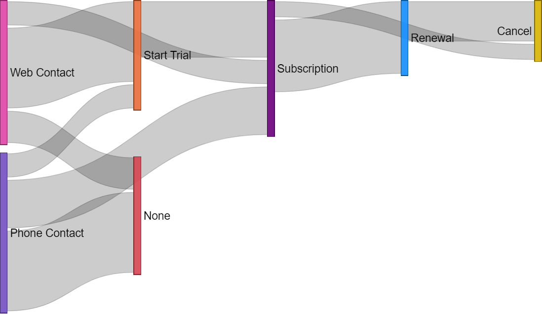
Example Sankey chart. Image source sqlbi
The skills focused on here are:
- Data wrangling
- PowerBI DAX functions
- PowerBI data modeling
- Generating Sankey charts