Data Analytics Projects for Beginners
Data Analytics Projects for Beginners
As a beginner, you need to focus on importing, cleaning, manipulating, and visualizing the data.
- Data Importing: learn to import the data using SQL, Python, R, or web scraping.
- Data Cleaning: use various Python and R libraries to clean and process the data.
- Data Manipulation: using various techniques to shape the dataset for data analysis and visualization.
- Data Visualization: display the data using plots and graphs.
Data Importing and Cleaning Projects
1. Exploring the NYC Airbnb Market
In the Exploring the NYC Airbnb Market project, you will apply data importing and cleaning skills to analyze the Airbnb market in New york. You will ingest and combine the data from multiple file types, and clean strings and format dates to extract accurate information.
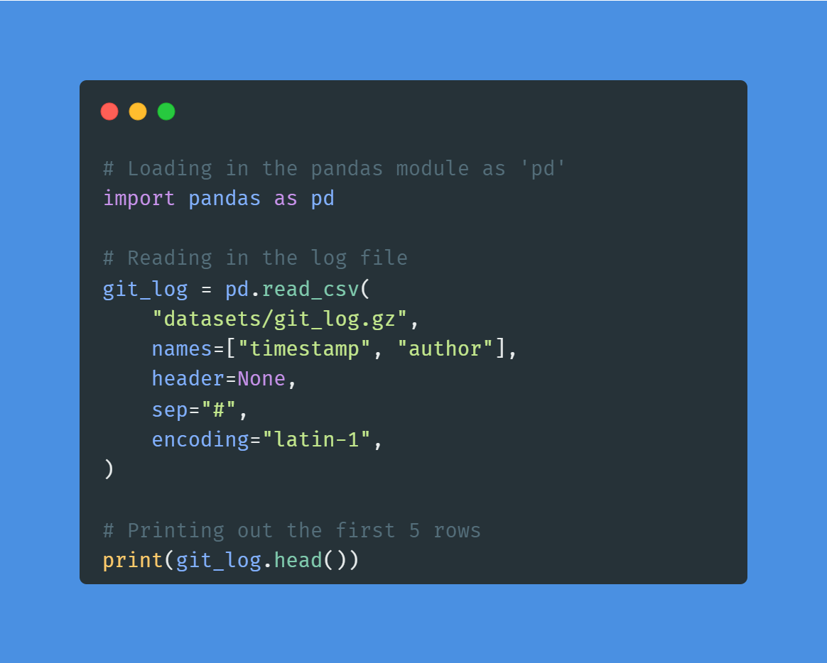
Image by Author | Code from the project
The project is perfect for beginners who want to get data importing and cleaning experience. You can apply similar methods to this Online Ticket Sales dataset to get even better at handling and processing the data.
Learn more about data importing and cleaning by taking short courses:
2. Word Frequency in Classic Novels
In the Word Frequency in Classic Novels project, you will use requests and BeautifulSoup to scrape a novel from the Project Gutenberg website. After scraping and cleaning the text data, you will use NLP to find the most frequent words in Moby Dick. The project introduces you to the world of Python web scraping and natural language processing.
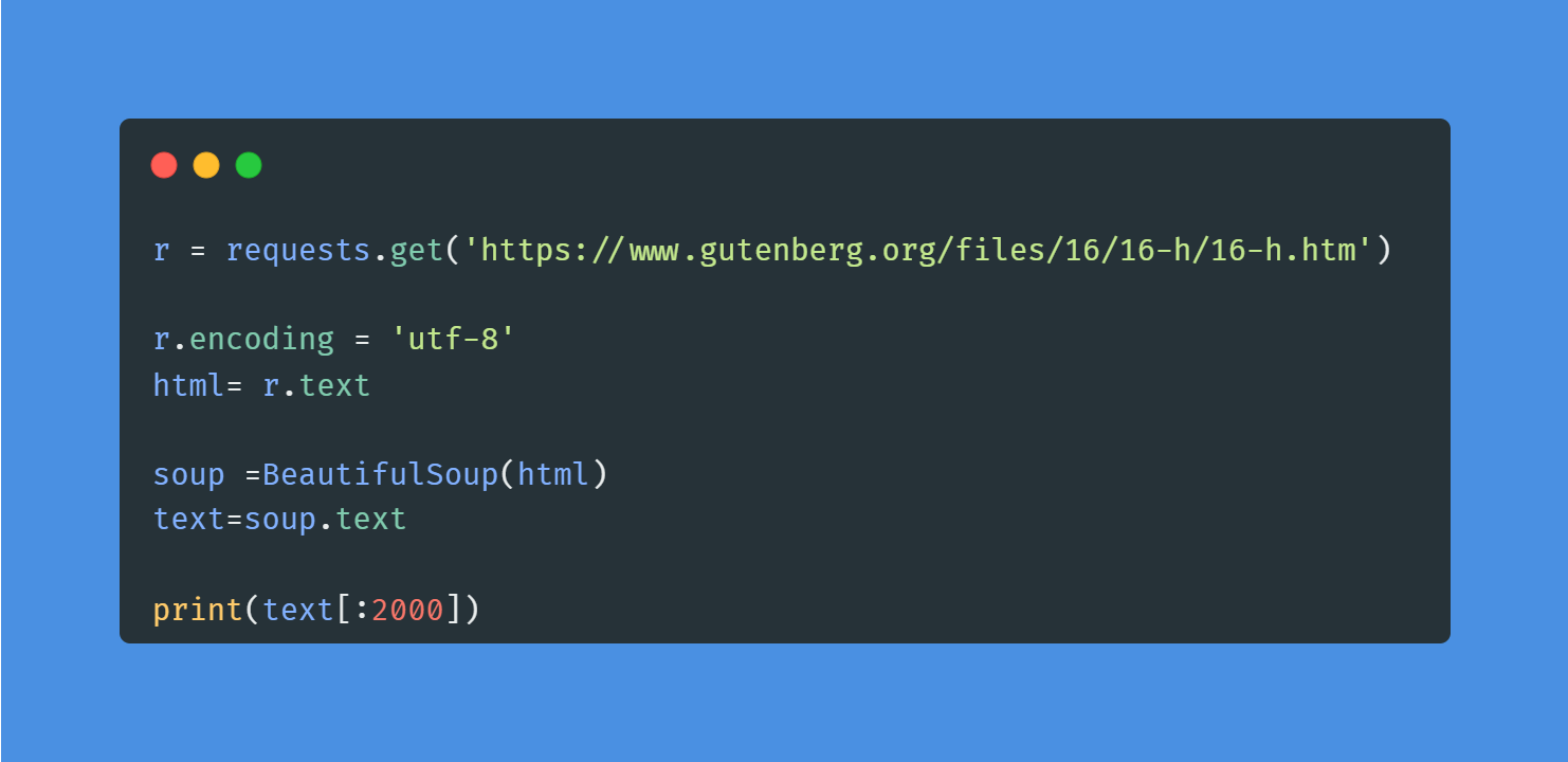
Image by Author | Code from the project
For data analysts and data scientists, web scraping is an essential skill to learn. You can take a short Web Scraping with Python course to understand the tools and components of an HTML web page.
Master NLP in Python Today
Data Manipulation Projects
3. Exploring the Bitcoin Cryptocurrency Market
In the Exploring the Bitcoin Cryptocurrency Market project, you will explore bitcoin and other cryptocurrency data. You will clean the dataset by discarding cryptocurrencies without market capitalization, comparing Bitcoin with other currencies, and preparing data for visualization.
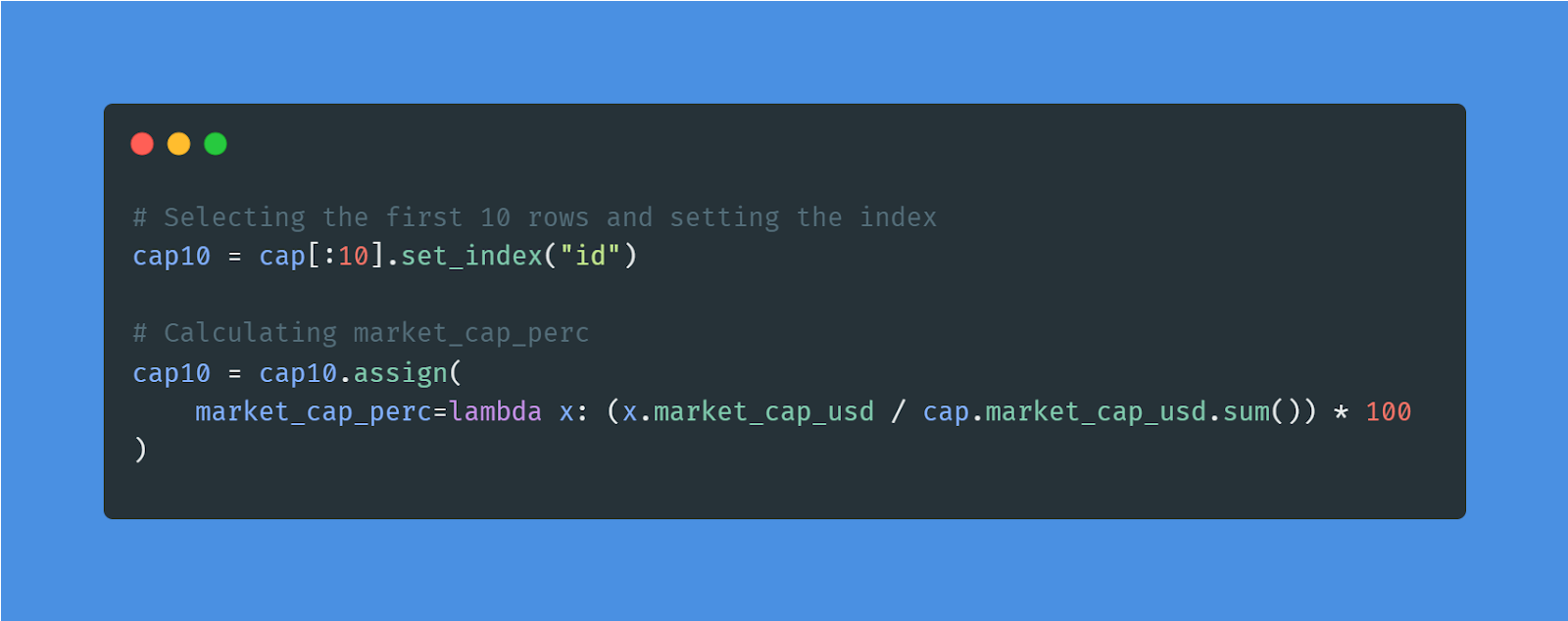 Image by Author | Code from the project
You can apply similar methods to Stock Exchange Data and learn to manipulate the data for data analysis. Furthermore, you can learn data transformation, aggregation, slicing, and indexing by taking Data Manipulation with pandas course.
4. Visualizing the History of Nobel Prize Winners
In the Visualizing the History of Nobel Prize Winners project, you’ll examine over a century of Nobel Prize history. Using Python, you’ll analyze and visualize data to uncover patterns and potential biases in how prestigious honors are awarded across categories like physics, chemistry, literature, and peace.
You’ll apply data manipulation techniques with pandas and craft compelling visualizations with Seaborn to tell a story with the data. This project is perfect for enhancing your data analysis and visualization skills while exploring one of the world’s most famous accolades.
Data Visualization Projects
5. Visualizing COVID-19
In the Visualizing COVID-19 project, you will visualize COVID-19 data using the most popular R library ggplot. You will analyze confirmed cases worldwide, compare China with other countries, learn to annotate the graph, and add a logarithmic scale. The project will teach you skills that are in high demand for R programmers.
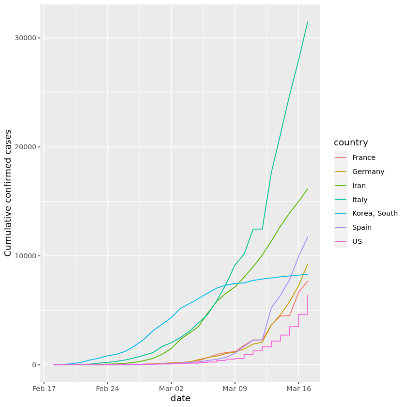
Image from the project
You can apply ggplot methods to Measles Data and gain more experience in data visualization and analysis. Moreover, you can take Intermediate Data Visualization with the ggplot2 course to learn the best data visualization practices.
6. Analyzing Super Bowl Viewership and Advertising
In the Analyzing Super Bowl Viewership and Advertising project, you’ll explore the drama behind the Super Bowl—from the games and advertisements to the halftime shows. Using R, you’ll manipulate and visualize data to uncover how these elements interact with one another. Perfect for building your skills in data analysis with tools like ggplot2 and dplyr.
Using the code to display interactive data visualization is easy, but understanding and interpreting the data is hard. Take the Understanding Data Visualization course to explain visualization distribution and learn the best data visualization techniques to communicate complex data.